What different shades and intensities of red are represented across the modern katana designs in thi
Updated Feb 2026
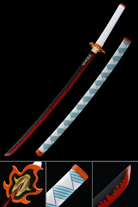
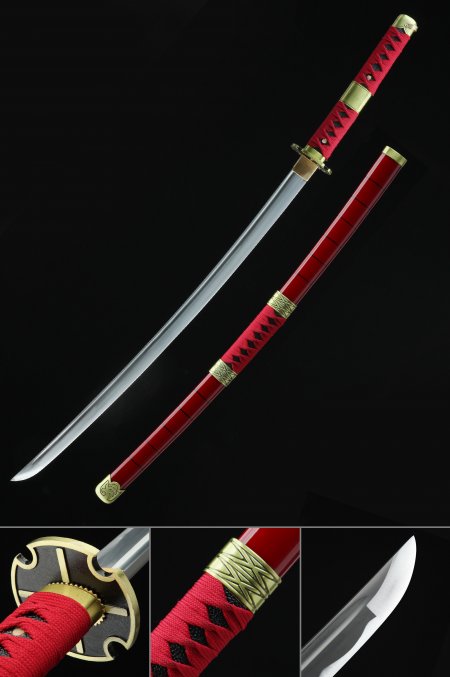
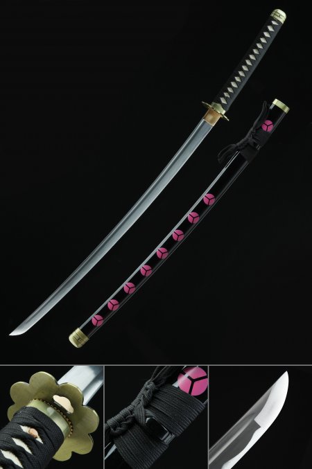
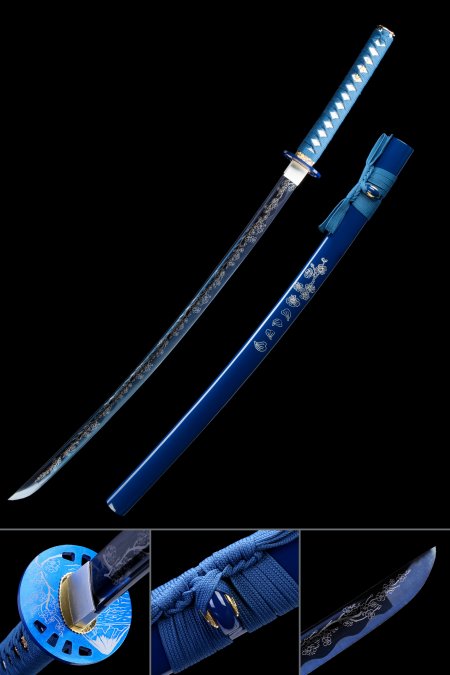
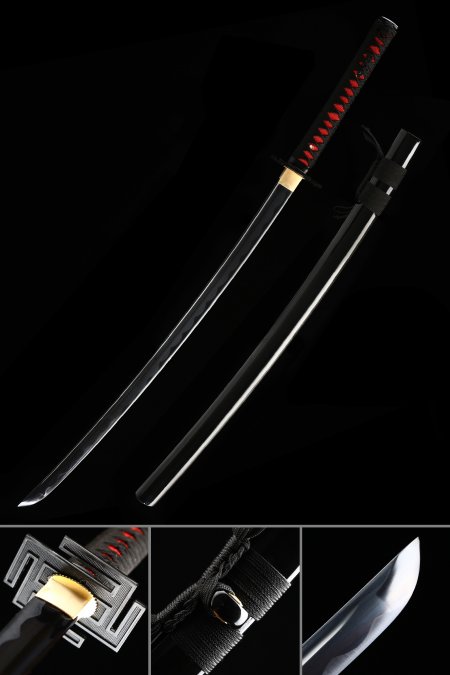
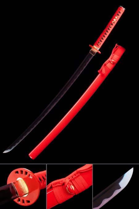
This collection spans a meaningful range of red expression through modern design interpretation. Bright vermillion red references the most iconic shade in Japanese cultural use — the color of torii gates and festival decorations — rendered with the clean, saturated finish of modern lacquer or coating techniques. Darker crimson and wine-red tones bring sophistication and restraint to the red palette, producing swords that feel more mature and subdued while still communicating unmistakable red identity. Some pieces feature matte red finishes that absorb light for a deep, velvety appearance, while others use high-gloss finishes that reflect light for a more dynamic, energetic presence. Metallic red options incorporate reflective particles that create a subtle shimmer effect, adding contemporary texture to the color. Two-tone designs pair red with black, silver, or carbon-fiber-texture elements that frame the crimson within a modern design context. The shade selection should be guided by both personal preference and display context — brighter reds command more attention and work better as standalone statement pieces, while darker or matte reds integrate more subtly into sophisticated display arrangements.